

Redefining User Authentication for a Seamless Shopping Experience
Lloyds Banking Group
Amazon wanted to build a financial product that people actually needed. Something different from what banks and finance apps already offer.
Most financial tools don't help with real problems. People struggle to manage spending, save money, and invest. The market is crowded with apps that make things more confusing, not less. People feel stressed and stuck.
I led the research and design for a new approach. I studied the market, analysed competitors, and validated ideas directly with customers. The goal was to build something that fit into people's lives and actually helped them manage money better.
The pitch was simple: Amazon could give people personalised financial guidance that actually connects to their real spending. Not generic advice. Not another budgeting app they'll ignore.Something integrated into how they already shop and live.The work showed how Amazon could help people feel more in control of their money without making things complicated.
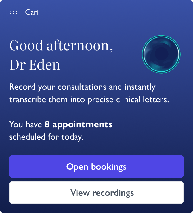
Cari AI is an AI transcription tool built for healthcare clinicians. It converts patient consultations into clinical notes.
After launching at Carebit, things went wrong. Clinicians stopped using it. The interface was confusing. People couldn't figure out how to use it properly. The tool felt unreliable, even if it wasn't breaking things.
When clinicians don't understand how a tool works, they don't trust it. And in healthcare, trust matters. If you're not confident in what the AI is doing, you won't use it.
This case study covers how I redesigned Cari AI from the ground up. I had to simplify the experience, make it intuitive, and prove to clinicians that it actually worked.
The result: Over 1,500 clinicians now use it across nearly 1,000 organisations. It's taken a significant admin burden off their plates. Hours of note-taking that used to eat into their day are now automated. That time goes back where it belongs, with patients.
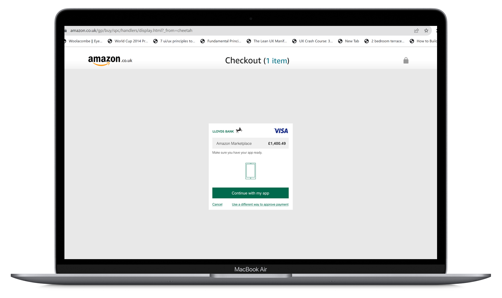
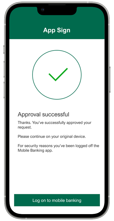
Lloyds Banking Group had to meet new security rules. They needed an authentication pattern that would work across everything, login, payments, and online shopping.
The challenge was designing something that could scale. One pattern, multiple uses.But it had to be simple enough for everyone to use. That meant customers with low digital confidence, non-native English speakers, and people who'd never done this before.
I ran multiple rounds of user testing. I watched where people got stuck. Identified which instructions caused confusion. Then they redesigned those parts. Each iteration fixed specific problems the team observed. Tested again, found new issues, and refined further. This cycle continued until the pattern worked for their most vulnerable users, not just the easiest one.
The results: 59% of customers used app-based authentication. 99% success rate across 31 million authentications.This case study shows how I designed it.
Pizza Hut UK had problems. Customers weren't coming back as often. Competition from delivery apps was tough. And their loyalty program was old and boring, people didn't use it.
They also wanted to expand globally. But first, they needed to fix the experience at home and build something that could work in other markets.
I was the Lead Product Designer on this project. I led the research to understand what wasn't working. I also mentored a junior designer through the process.
I redesigned the loyalty program to make it more personal and easier to use across different channels.
Three months after launch in the UK:
Customer retention went up 25%
Average order value increased 15%
Loyalty program engagement improved 12%
The results gave Pizza Hut a working model they could take to other countries.
Amazon wanted to sell insurance online. The idea wassimple: let people shop for home insurance the same way they buy everything else on Amazon. But we had a problem. 95% of people who landed on the page left immediately.
I figured out why they were leaving. The landing page had three confusing buttons with insurance jargon. People didn't know which one to click, so they just gave up. I simplified it down to one clear button, moved the insurance type selection to a separate page, and used pictures to explain the options. After two weeks of testing, we increased conversions by 7%.

Strong Customer Authentication (SCA) regulations created real problems for users:
Lead Product Designer
6 months (Research, Design, Launch, and Iteration)
I collaborated with a researcher to conduct four rounds of usability research across four UK locations: Halifax, Ilford, Edinburgh, and London. I led the sessions in London and Ilford, while my researcher covered the other locations.
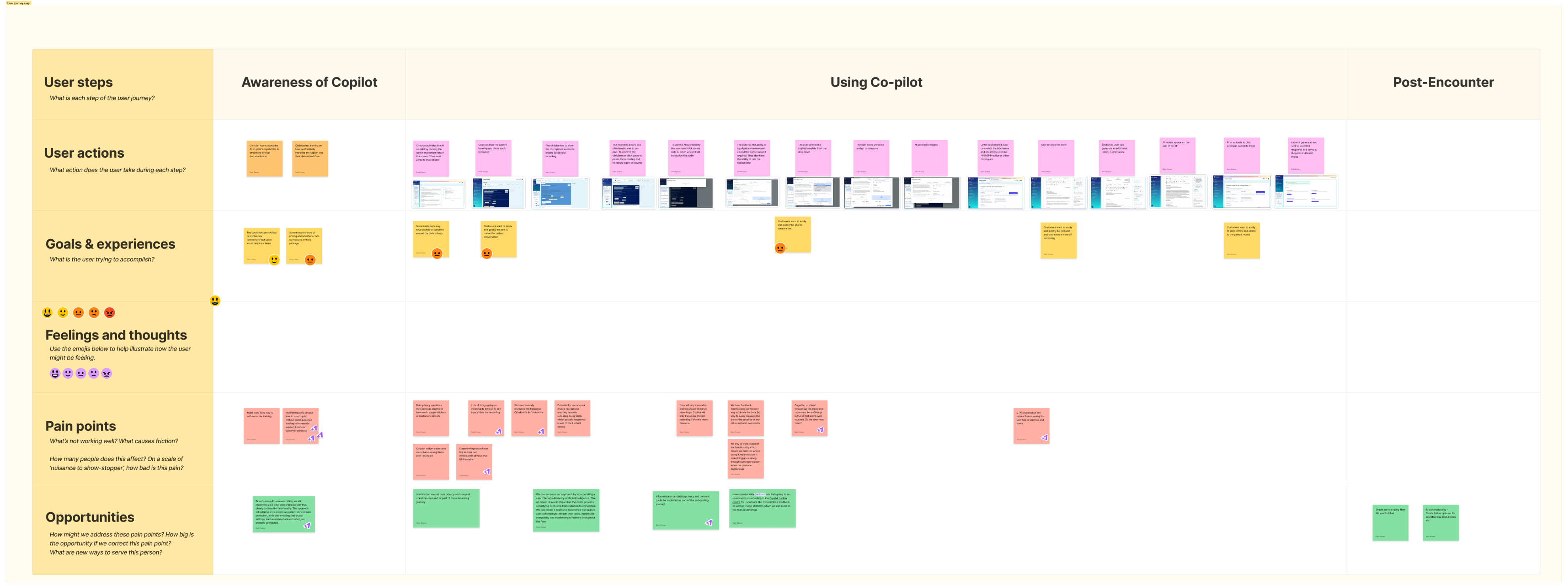
Through this research, four critical issues emerged that were preventing adoption and eroding trust in the product:

Poor UX
The interface was confusing. People couldn't figure out how to use it.

Privacy Concerns
Privacy wasn't clear. Doctors didn't know where audio was stored or who could access it.

Cognitive Overload
Too much information at once. Dense screens made more work, not less.

Technical Instability
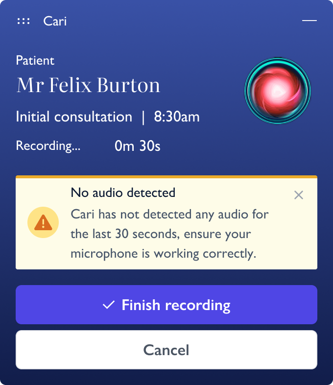
Technical problems. Microphone issues caused blank recordings
By the end of the research phase, I had amassed a rich dataset providing a comprehensive understanding of our customers, the competitive landscape, and key considerations for global scalability. The research revealed six critical pain points that would inform our solution design:
Problem Statement:
How might we redesign PizzaHut's customer and loyalty experience to increase retention and engagement while creating a personalised, scalable solution that can be adapted for global markets?
The complexity barrier - The loyalty program was too confusing. People gave up trying to understand it.
Delayed gratification problem - Rewards took too long to earn. By the time you got anything, you'd forgotten about it.
Generic experience frustration Nobody got personalized recommendations. Everyone saw the same menu.
Channel inconsistency - The experience was different on web, mobile, and in-store. It felt disconnected.

Discovery challenges - Hard to find new menu items. People stuck with what they knew.

Competitive threats - Competitors were doing better. Delivery apps had cleaner interfaces and faster rewards.

How might we design a secure, intuitive authentication experience that builds customer trust, maintains compliance with SCA regulations, and accommodates diverse user needs without disrupting the shopping journey?
Based on research insights, I developed a refined authentication experience through an iterative design approach:
I created animations in After Effects to fix the main problem, people not knowing when to open the app. The animations gave clear visual cues while matching the brand.
I exported them as Lottie files so they'd work smoothly on desktop and mobile. One comprehensive animation showed the complete journey in the mobile app, connecting all the pieces.
I worked with a copywriter through many rounds, testing different versions and getting team feedback. We made sure every instruction was:
I prepared everything developers needed:
I built interactive prototypes and tested them across locations. What we learned:


Once inside, customers got a complete tool that worked with their existing apps and spreadsheets:

We adopted a phased rollout strategy to minimise risk and gather focused feedback:
• Phase1: Subset deployment for carefully selected card brands to identify and address unforeseen issues
• Phase2: Performance monitoring with close attention to key performance indicators and user feedback
• Phase3: Gradual expansion to remaining brands while continuing to refine based on data
During deployment, the push notification team was unable to deploy simultaneously, which meant customers had to navigate to the banking app manually. However, the refined copy and animations ensured the user flow remained clear, and we gathered valuable analytics while waiting for push notifications to be enabled approximately one month later.
The authentication experience launched in July 2021 and demonstrated consistent growth and improvement:
The redesigned customer and loyalty experience deliveredsignificant measurable improvements within three months of UK launch:
The design proved security and usability can work together when you build trust into every detail. By focusing on clarity, accessibility, and iteration, we turned a regulatory requirement into something that actually worked for millions of customers.
What I Learned:
- Visual guidance cuts mental effort.
- Custom animations were essential for cross-device flows.
- Copy is design. Working with copywriters improved understanding dramatically.
- Start small, then scale. Testing with a subset first let us iterate quickly.
- Give people options. Multiple verification methods built trust and worked for different needs.
- Design for problems. Despite push notification delays, clear visuals and text kept it working.
- Track everything. Good analytics specs gave us data to keep improving.
The project delivered comprehensive proof-of-concept prototypes and strategic recommendations for Amazon's board:
The redesign worked. But more important, it showed that you can rebuild customer loyalty if you make things simple and personal.
Key things:
• Simple wins. The new loyalty program was way easier to understand. More people used it.
• Rewards need to come fast. Small rewards often beat big rewards later.
• Personalization increases order value. People bought more when we suggested things they'd like.
• 400 survey responses gave us confidence. Good data helped convince stakeholders.
• Mentoring multiplies impact. Teaching the junior designer made both of us better.
• Launch what matters first. We cut features to hit the deadline. That was the right call.
• Connect everything. Web, mobile, in-store. If it's not consistent, people notice.
• Think global from the start. Built the system so it could work in other countries later.
Amazon's board decided not to move forward with Amazon Money. This happens in large companies. It's part of the job.The experience taught me that creating something isn't enough. You have to champion it through layers of evaluation. Product designers bridge the gap between innovation and business reality.
What I Learned:
- Test with customers early and often. It strengthens your case.
- Build on what already exists. The best opportunities fit into familiar places.
- Give people insights, not just data. That's what keeps them coming back.
- Automate the boring stuff, but let power users take control when they want.
- In financial products, be clear about data and security. Always.
- You need to advocate for your work. Decision-makers don't always see what you see.
- Each setback teaches you something. It gets easier to navigate these situations.
The redesign showed that trust and usability can't be separated in healthcare AI. You need both. By rebuilding from scratch and focusing on clarity and transparency, we turned a failing product into something doctors actually use.
Key things:
• When users are busy, find other ways to research - Support staff were helpful when doctors didn't have time.
• Trust needs to be designed in - Privacy messages, progress indicators, and review systems all mattered.
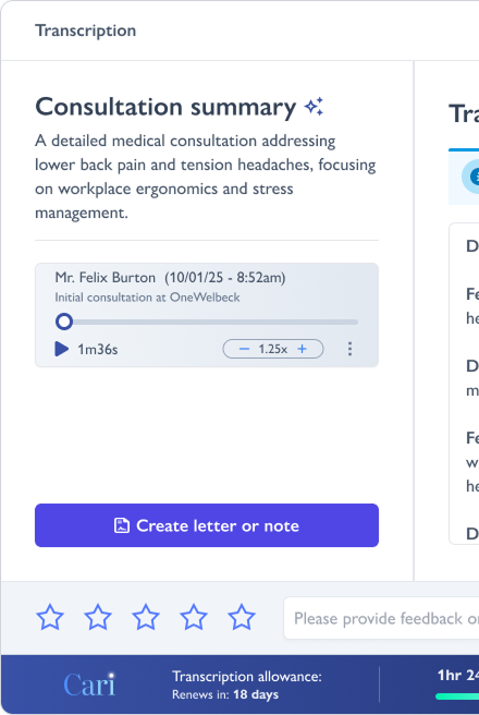
• Simple beats feature-rich - The three-step workflow was easier to understand than the old version.
• Start small - Rolling out to power users first let us fix problems early.
• Track everything - Analytics gave us visibility we never had before.
A 7% increase is good. But we still have work to do. The page is better, but it's not fixed.
There's still another problem to solve: do people even want insurance from Amazon? That's a bigger question. It'll take more than design changes. It needs the company to decide if they're serious about insurance.
What stuck with me:
Crafting Experiences, Shaping Futures, Designing Products for Tomorrow